Client:
Propel ATL (previously known as Atlanta Bicycle Coalition)
Ask:
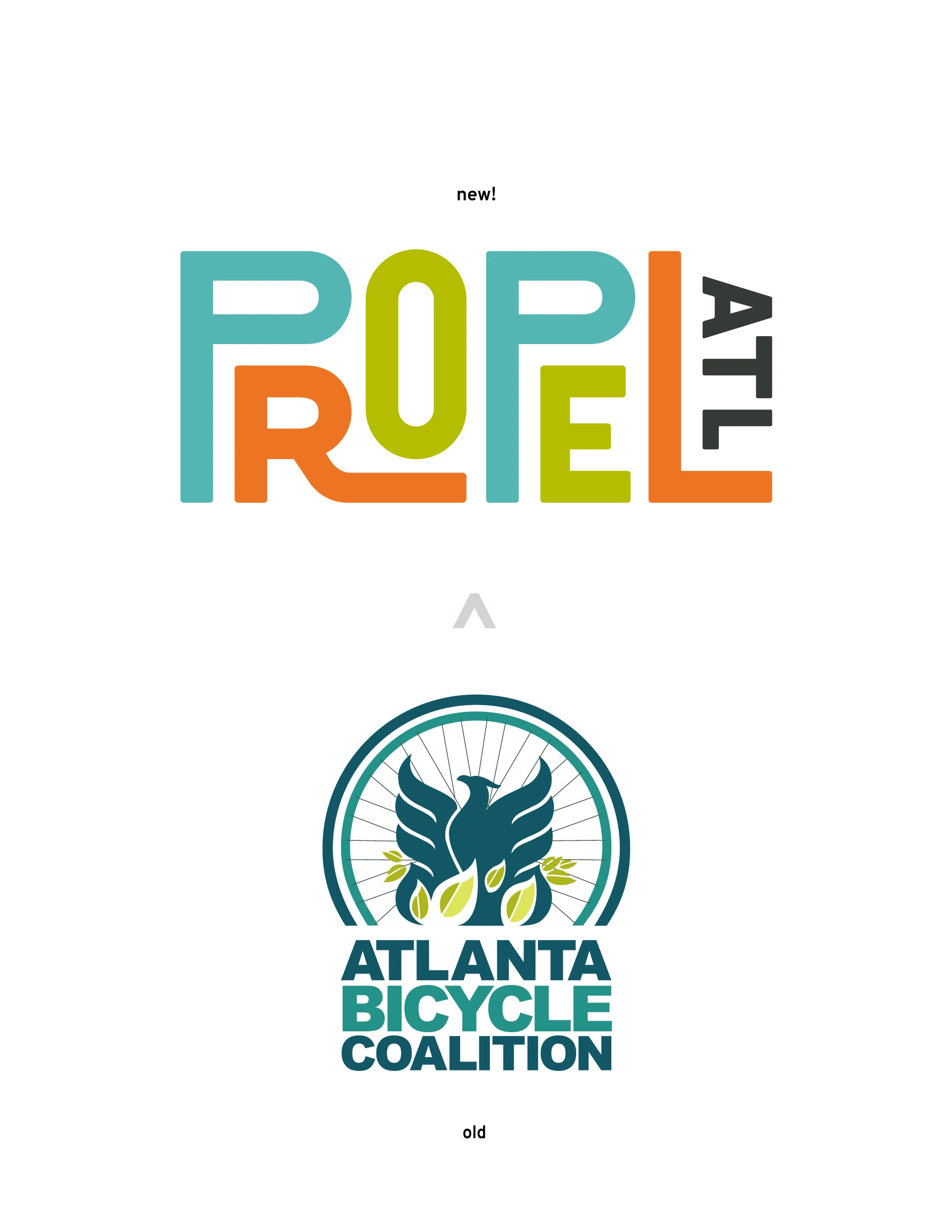
Founded in 1991 as Atlanta Bicycle Coalition, the organization’s original goal was to reinvent cycling infrastructure in Atlanta. But with time, networking, and partnerships, they realized that they could do so much more. On their 28th year, they created a comprehensive strategy to revamp all non-car transit and reached out to us to see if we’d like to pitch an RFP to be a part of their rebranding effort.
Creative:
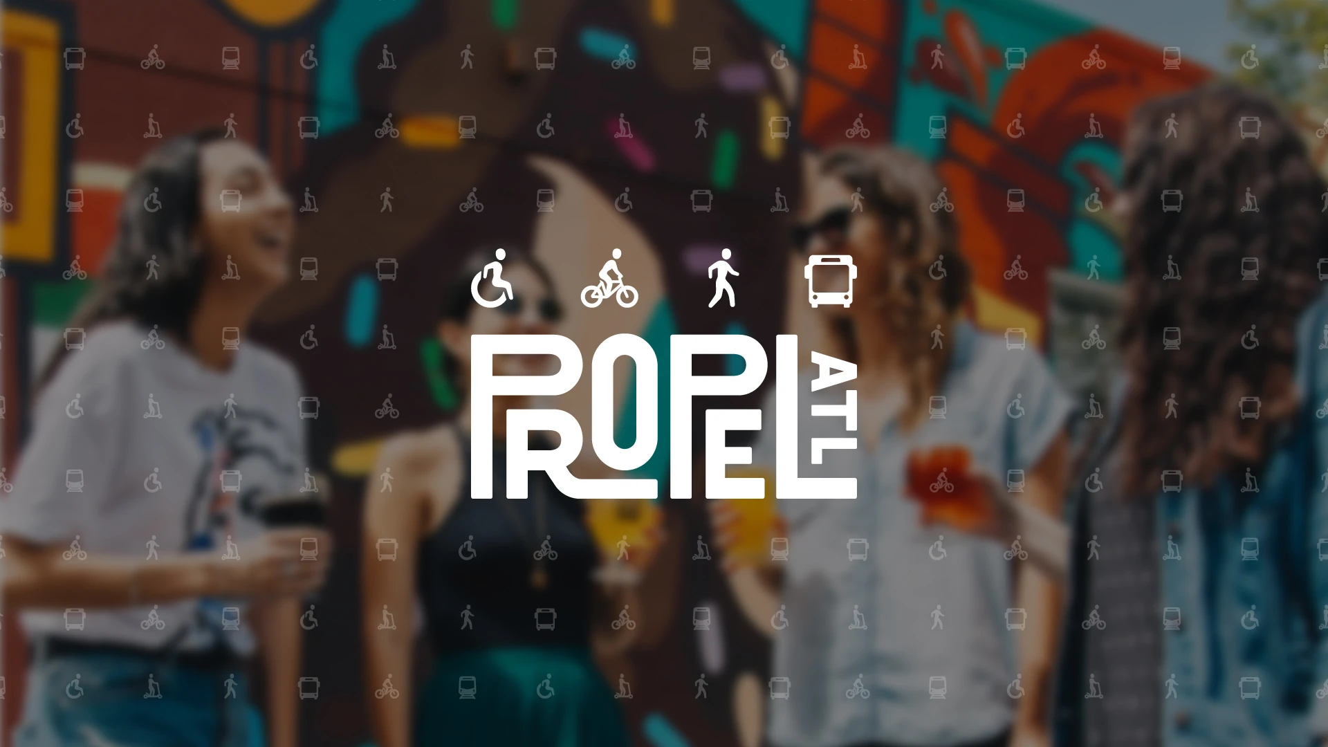
Our research into local communities directly affected by non-car transit allowed us to create an interlocking, custom logotype that showcases how a well built, interlocked community should be represented.
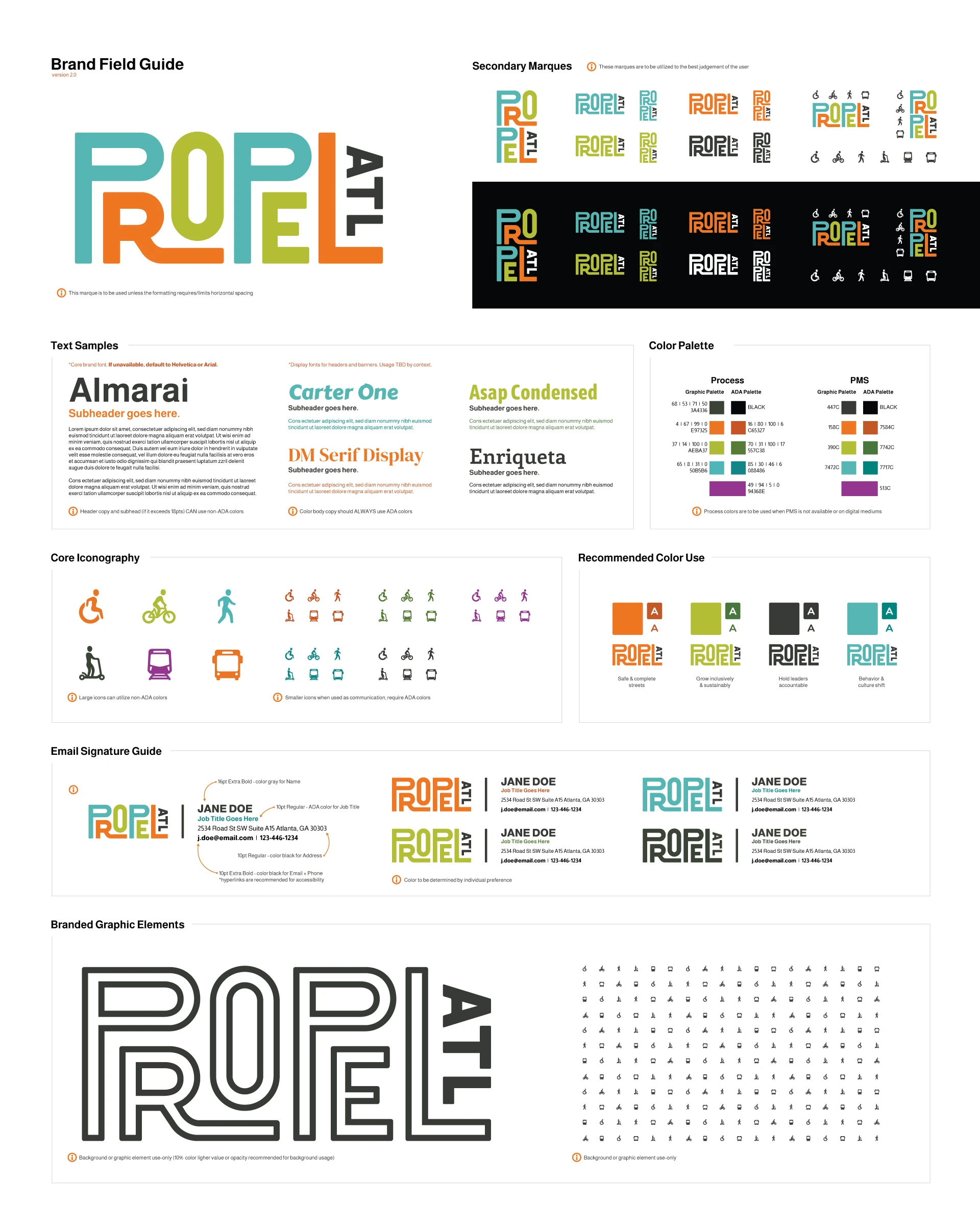
This city map + transit line-inspired wordmark is further supported by a rich but welcoming color palette, gender-neutral and active iconography, and a candid photo direction.
This project stands for a lot of our beliefs around how communities should look out for one another. If you’re ever in town, look them up and join their events!
