Client:
A Turkish restaurant.
Ask:
Clean, approachable, upscale brand that reflects some aspects of Mediterranean culture.
Creative:
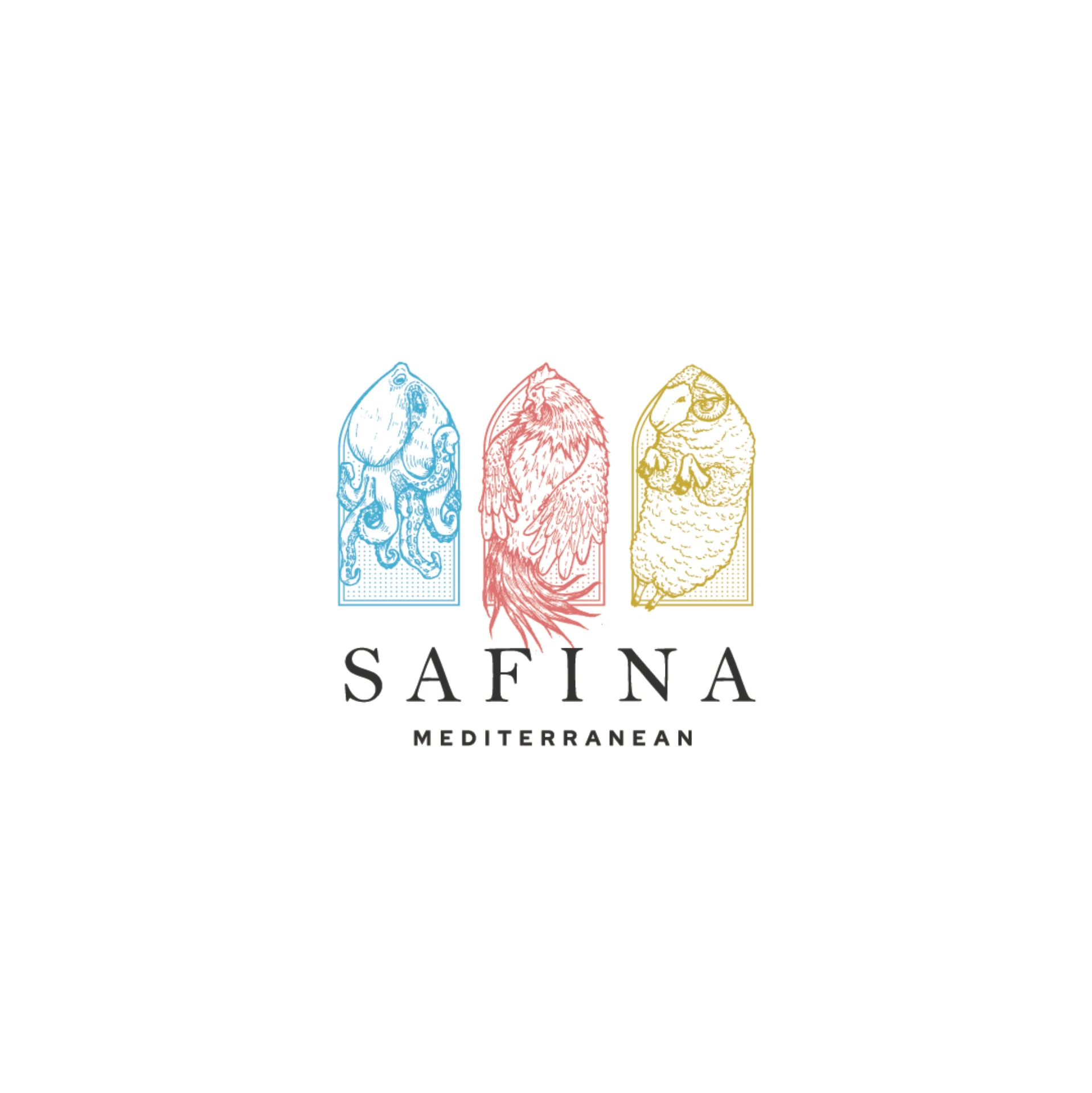
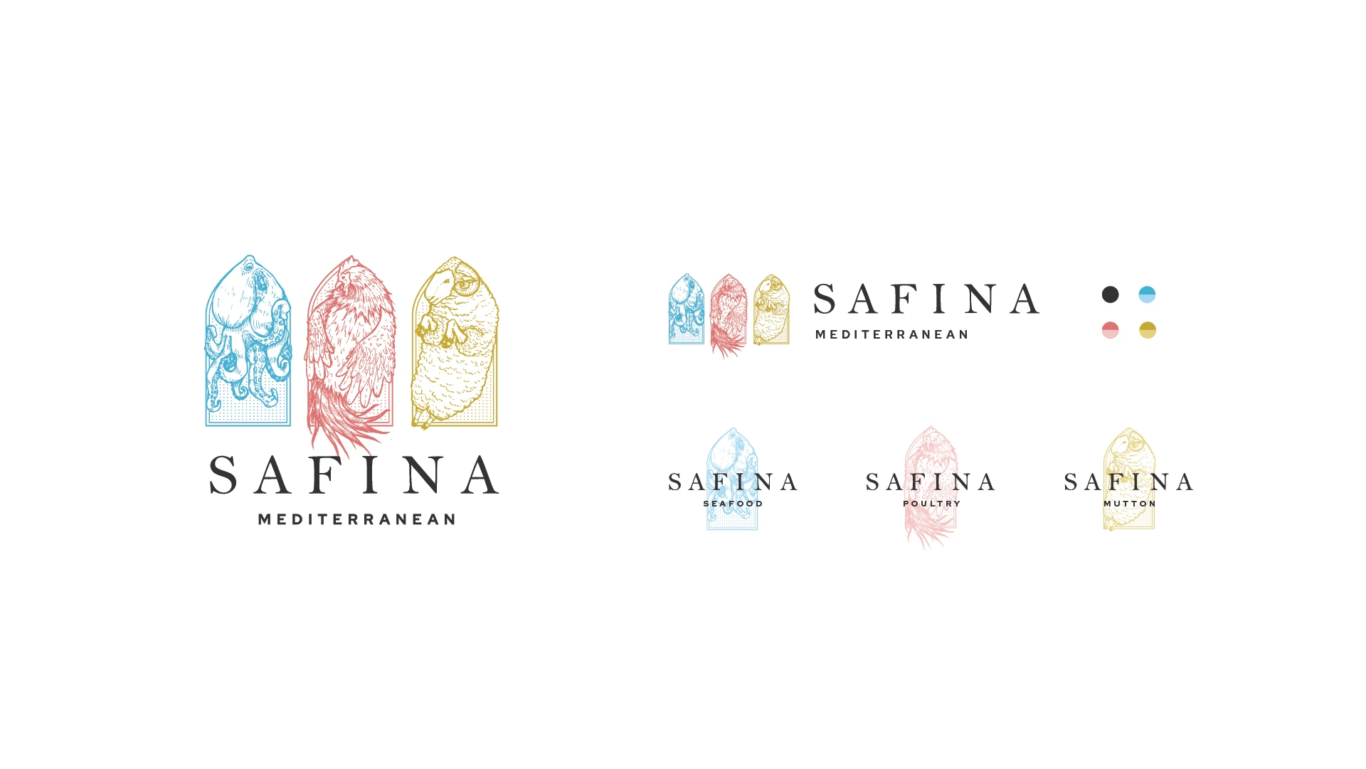
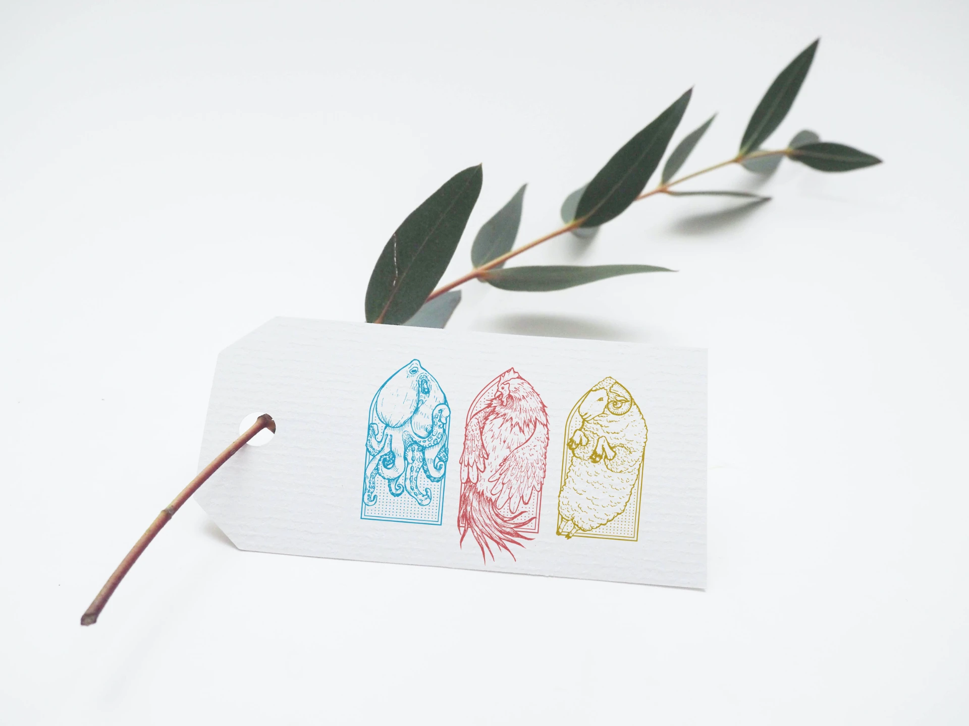
Through a bit of research, we found that Mediterranean architecture often has archways featured in sets of three.
We utilized this rather specific aesthetic to build an illustrated brand which showcases their main proteins supported by a timeless logotype that pairs a traditional serif with a geometric sans serif.
